From the Studio - Interview with Simon Degroot | 22.09.22

Studio photography by Charlie Hillhouse.
In our latest From the Studio interview, Jan Manton Gallery visited Simon Degroot’s studio to learn more about the references, influences, and layers embedded within the artists’ paintings for his new exhibition Simultaneous Disguise, showing between 28 September - 15 October 2022.
Embie: Simon, thank you for having us in your studio today. For your upcoming exhibition Simultaneous Disguise, you have included some references to popular design from the 1980s, including details from Memphis design as well as smiley faces. Could you tell us more about this influence on your work?
Simon: This exhibition, alongside other large works, includes nine small works that are oil painted on aluminium panels. On these panels, I have painted sections reminiscent of Memphis surface pattern design. I have always liked these laminate designs created for Abet Laminati by Italian architect and leading designer Ettore Sottsass.
The laminate patterns were used as veneers for furniture and for textiles. I like them because they are abstractions from everyday objects such as Italian terrazzo or chain link fences. These designs for flat surfaces were so common for me growing up as a young artist. The legacy of Memphis design could be seen echoed on the cover of school books, the printed fabric of t-shirts, and for the television set designs such as Pee Wee’s Playhouse.
Embie: The smiley face in the centre of each of the nine small works is an image people may already be familiar with in contemporary life and popular culture. Why did you choose it to be a recurring motif in this series?

Simon: For me, the smiling emoji is an intervention onto the already patterned surface. Like scribbled drawings on a school exercise book or scratched into a desk, here the smiley face is part defacement and part personalisation. As a combination of colon and bracket, this smiling - or more accurately smirking - face makes use of glyphs. This is important in my work where abstract details come together to create meaning. It is also connected to my background in commercial printing and interest in typographic ornament.
Embie: Your practice has always considered and been informed by design and its elements, as well as the shapes seen in built environments. How is incorporating aspects of Memphis surface design expanding your current practice?
Simon: I’m fascinated by the possibilities of a flat surface. How can we use layering to better understand ideas of concealing and revealing? What happens when the most visible, anterior, or frontal form is hiding something that is behind? What does this tell us about visibility and appearances? How can painting help us understand more about the politics of seeing versus not seeing?
To explore these ideas, I sometimes hide parts of my paintings underneath more paint. The overlaid painted sections are revealed through their pentimento, where previous layers of paint are perceived in the painting which visibly captures a history of the surface. Importantly, these painted layers are visible in real life, but they don’t exist if this was a design on a digital screen. As with the overlaid smiling emoji or painted asterisk, they simultaneously conceal and draw attention to what is painted underneath. Differently to the two dimensions of the flat screen, this effect is particular to painting.
In Simultaneous Disguise, all the works reveal evidence of their history through close examination of the painted surface. The smiling face and the asterisk work in this way to ornament familiar flat surfaces.
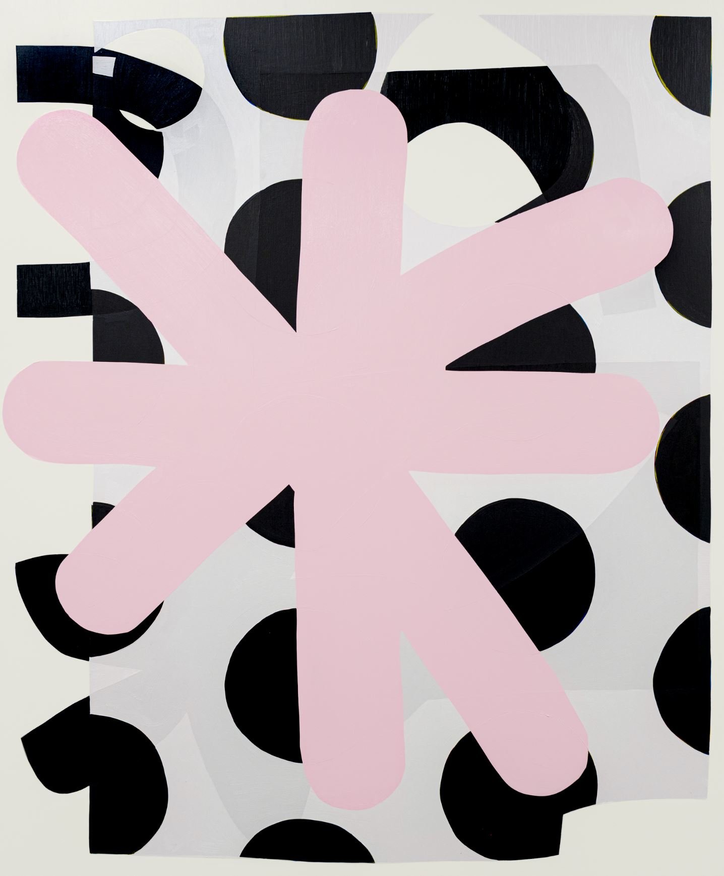
Sarah: In your work Asterisk, a pink asterisk symbol sprawls across almost the entire composition, painted over a polka dot pattern. What is your relationship with the asterisk?
Simon: The asterisk holds a similar meaning to the smiley face. Just like the smiley face, the asterisk is a glyph or keyboard character, and often appears when you need to refer to something else. It is a typographic example of what I'm exploring in my practice, which is that my shapes and forms are always connected to something else. What that something else is, isn’t always clear.
Looking closely at this work reveals that the polka dot pattern is painted in four layers of colour in reference to four colour or CMYK process printing. Again, this relationship to commercial printing techniques is important in my work because it speaks more broadly about image making.
Sarah: Yes, those glimpses of CMYK colours hidden beneath the black layers resemble the colour misalignment when looking at some printed images in books which is a clever nod to your background. What are some of the ways your knowledge of commercial printing processes have affected your painting process?
Simon: Sometimes when buying something with printed images these might be misregistered or have a mistake. This mistake draws attention to the individuality of the item, drawing attention to its difference in comparison to all others. Nothing is ever an exact copy. There are always minuscule differences. These differences become more pronounced over time due to wear and tear, but, even in the beginning, identical items are never the same. This is something that I am interested in and am exploring through my work in the studio.
Embie: Yes, this is a nuanced part of your work. Once those differences are noticed, it may lead the viewer to examine or inquire about who you are as an artist and what these different layers mean to you. Even the asterisk in Asterisk lacks symmetry, which connects back to the idea of everything having individuality.

Simon: Yes, I think that’s right. The more we try to remove evidence of the human touch, the more important and the more evident those details become. It’s like Isabelle Graw says, ‘the more negation there is of handwriting, the more this negation will be considered to be the handwriting of the artist’.
Sarah: The trace of human touch and an idea of recreation throughout the works in your show acknowledge that what we are surrounded by today are reinterpretations of images from past eras. Is there a link between the emoji and the asterisk and Memphis design, in particular? Or do they operate as two separate aspects?
Simon: I think they remain separate. I am interested in the circulation of popular details, how they work across different material states and how they are used. I am looking at a couple of specific examples of popular design but also from painting. Shirley Jaffe has also been a big influence in my work.
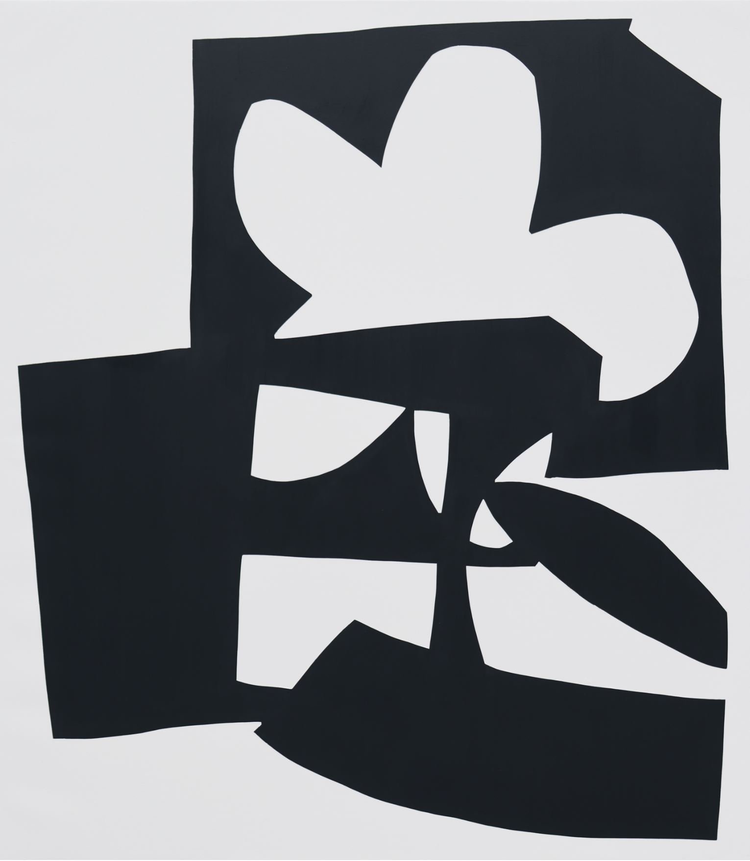
Embie: The largest piece in the show, Whirling Hop and Skip After SJ, is a work in homage to her, yes? Could you tell us more about this painting?
Simon: Whirling Hop and Skip After SJ references two works of Shirley Jaffe, Whirling Dervish ou Indian Flight (1986) and Hop and Skip (1987). Jaffe aimed to create shapes in her work that did not not refer to anything else in the real world. I feel like this is incredibly difficult to do. Studies in perception note that to make sense of unfamiliar images or shapes, we apply what we already know to false guesses that we then correct until we find a reasonable solution. Looking for familiarity in abstract images brings about a change in perception as the repeated false guesses transform the unfamiliar into the familiar.
For me, this painting is in conversation with the original works by Jaffe. It’s a loving gesture or an homage. Overall, the works in this show are in conversation with other artworks and with each other. Through layered images and overlapping paint, I am exploring a simultaneity where images can both be revealed and concealed at the same time. Where I can create something new whilst also acknowledging my sources.

Simultaneous Disguise is showing between 28 September - 15 October, 2022.
Interview by Embie Tan Aren and Sarah Meehan. Studio photography by Charlie Hillhouse.